Different Class
Different Class Ltd will be introduced into the primary school sector, to begin with (this is subject to broaden as the brand develops!). A learning mentor-based service with the underlying philosophy of building trust and a relationship between the mentor and the families. Everything will be centred around the child's wellbeing and understanding of how they feel. Bespoke plans will be written for the children depending on the area of education they need help with.
Services
Logo design / Branding /
Typography / Print
Better Living Homes
Better Living Homes required a brand identity for properties that incorporated assisted living for
16-18 years old. Safe secure environments for young people to live under the guidance of local authorities.
Services
Logo design / Branding /
Typography / Print

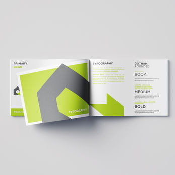
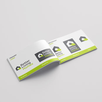
The identity required a fresh minimal approach. The word ‘Homes' needed to stand out and was a key point stated within the initial brief. The green arrow within the grey house-shaped icon... highlights the word Homes. This was achieved by colour association and the fact that the arrow is also pointing to the word Homes. The arrow also represented doors opening for young lives and opportunities to move forward.
Rounded typography was a contrast to the house icon with sharp and blocky lines. This gave the identity a friendly but professional balance.


